I have often witnessed an extraordinary design concept with poor selection of colors. All designers must remember is that a great web design is a perfect combination of typography, layout and, of course, color schemes. As a designer, if you are capable to make these aspects work and complement each other, you will give birth to a perfect web design. Color schemes definitely play a vital role in designing any interactive website. I personally believe that it can also serve as a means of communication. We all know that whenever a visitor visits any website, color schemes are one of the first things he notices.
There are multiple reasons to why color schemes are super important and take a big role in any design process. One of the reasons is that colors can deliver your message across. Not only this, your color scheme will also affect the mood of your visitors. Effective and good color schemes will influence your visitors in many ways. You can imagine the importance of color schemes with the fact that multi-national corporations are investing millions of dollars these days to decide a perfect color scheme for their brand, packaging and of course websites.
The web is undoubtedly chock-full of so many color scheme tools that will help you in making the perfect color scheme. Obviously, not all tools will bring the same mesmerizing effect but yes, these tools can help a lot. In order to make things convenient for you, we have compiled a list of some of the great tools for selecting color schemes for your website.
We'll get to the tools later in the article; let us take a look at some of the latest trends in color schemes.
Trendy color schemes for mobile designing:
Earlier, people have been playing safe with color schemes when it came to mobile designing. However, now, people are open to experiments and are using some interesting and cool color schemes. Since mobile screens offer limited space, you need to be very careful with what you display. A mobile user is way too distracted and your app will only get attention if your color scheme is attractive. If you want your color scheme to work, make sure it is well executed.
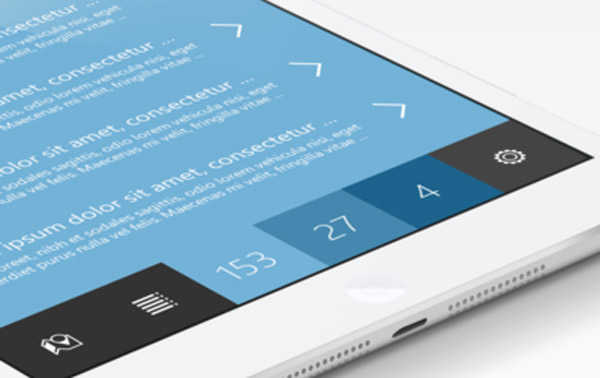
- Color as accent:
Accent colors are very popular and are being used everywhere. They are mostly used to guide users. If you are doing this in mobile, better go with big, bold and beautiful colors because they catch attention easily. Following examples will help you understand the above statements in a better way.
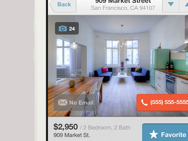
http://dribbble.com/shots/932927-Listing-Detail
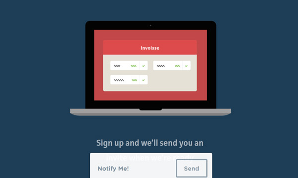
- Color as a statement:
Making a statement is not at all difficult. All you need to do is be heard and do something wild. Why? It grabs attention, simple as that. Your color scheme should be attractive along with bold typography.
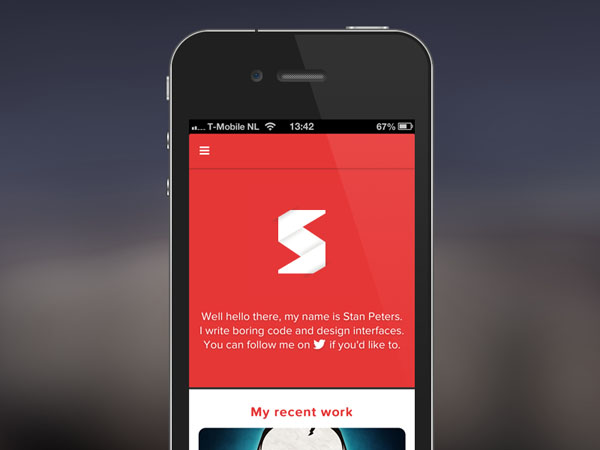
http://dribbble.com/shots/932322-Portfolio-restyling

http://dribbble.com/shots/947816-Data-tracker
- Color and emotions:
As mentioned earlier, colors play an important role in emotions. Every color defines something and they can be very powerful. Use colors relevant to your product.
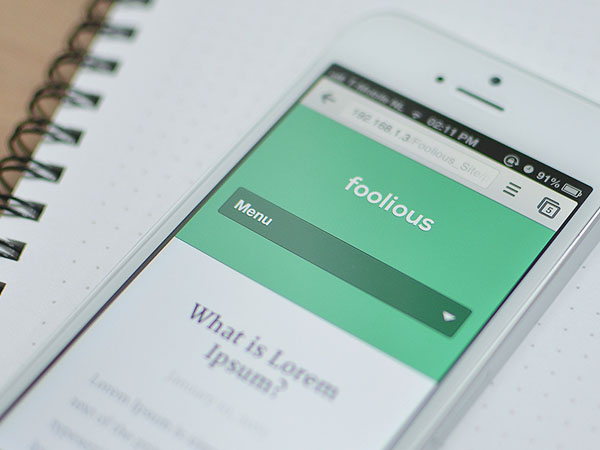
http://dribbble.com/shots/941102-Foolious-Main-Site
Trendy 'Retro' color schemes:
Old is gold, and what was once old can be new again. Retro color palettes are trending and the comeback mostly contains all retro colors i.e., from yellow to browns to blues. Retro colors are not that saturated and have a little bit of flat look.
- Characteristics of Retro schemes:
The retro color scheme can be judged by the fact that there won't be any bright colors. You will have to purposely manipulate colors in order to come up with a retro color palette.
- Retro fonts and textures:
Like I said earlier, typography plays a very important role in highlighting color schemes. I would suggest you to go with period lettering as they will also give a retro look.
Flat design color trends:
Flat design has been the talk of the town recently. When it comes to flat designing, you can go with variety of colors. However, as the trend suggests, you should go with bright colors. The best thing about flat designing is that designers are experimenting and expanding color palettes. Designers are using even four or more colors. Flat design can have following color palettes:
- Bright colors
- Retro colors
- Monotone colors
http://dribbble.com/shots/912418-Flat-List
So in short, flat design is a perfect mixture of all trends.
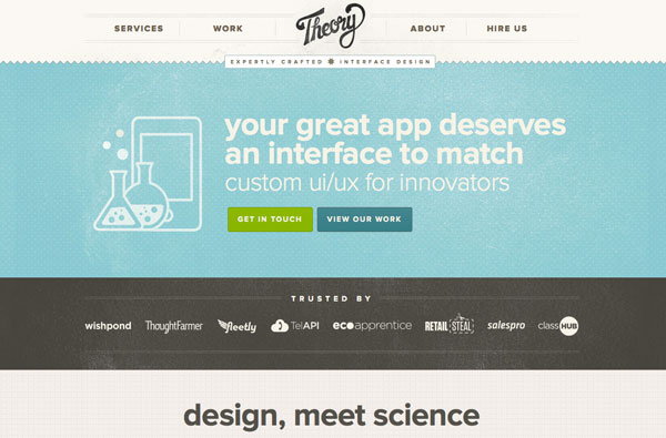
Popular New Trends in Color Schemes For Website Templates (Taken from IM creator - HTML5 website builder):
http://app.imcreator.com/preview?vbid=731B225BBCBA447898A67C95949974BB
This template is a great example of latest trends in color schemes. As per the latest flat design trends, they've kept the background white and spacious. Also, you can clearly see the typography and use of pastel color to highlight the tabs. Looks perfect for any new, trendy website.
http://app.imcreator.com/preview?vbid=CF774CCC7FCD47D79298F5D7CDE74725
I personally like this template as you can see the border of the website with a combination of two pastel colors. The background of the website is again plain white with text in the same colors as used in the border to create a harmony. The area that needs to be highlighted has been differentiated with the typical and perfect black and white combination.
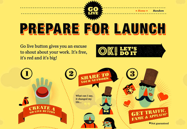
http://app.imcreator.com/preview?vbid=246178C89E514CDFB474685213D40A16
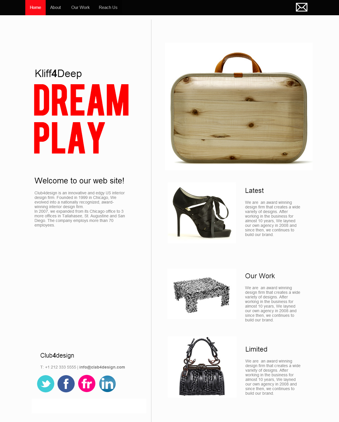
This one is definitely my favorite template. I love the white and red combination. It not only looks good but if you plan to play it safe, this is perfect for you. Plain white background, red text to highlight important content and rest of the content in a perfect white, gray and black color looks amazing. Also, the products are properly highlighted with almost no distractions.
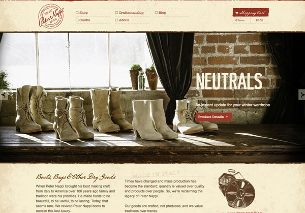
http://app.imcreator.com/preview?vbid=5DCEC7F9A03344B3AA296A954F4DF44D
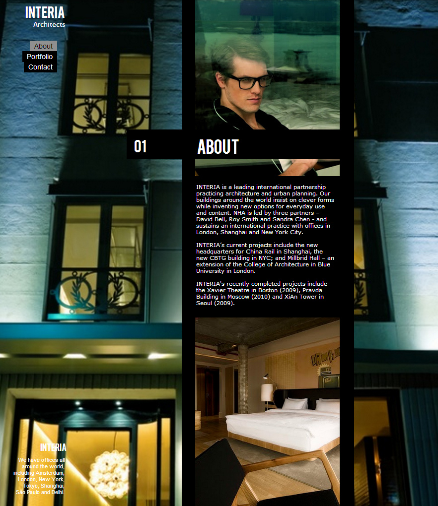
I consider this to be a creative layout where the background is black but images are used as well. Plain white and bold text is used on the black background. Looks subtle, neat, crisp and attractive.
Now let us take a look at the tools to tweak the color trends:
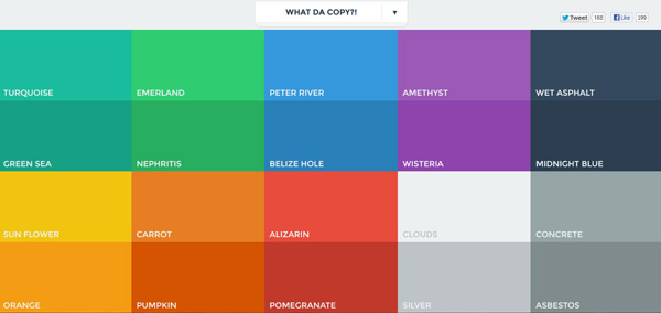
With this small web app, you can copy the colors from flatUI. This is basically kind of responsive so it can be used with a small browser having a widget.

Again a great tool, in fact a color wheel in order to help you with creating color schemes. You can not only create a scheme, but also select from the tool's themes.
http://www.colourlovers.com/copaso/ColorPaletteSoftware
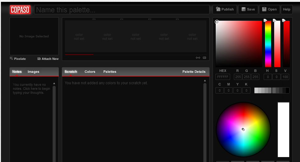
COPASP is a color palette software and will help you in creating a color perfect color palette. You have two options to select from - basic and advanced and if advanced comes across too rich for your taste, you can always go back to the basic color palette tool.
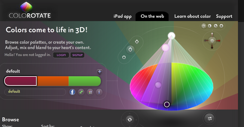
This tool will bring your colors to life in 3D. Here you can either browse color palettes or even create one yourself. You have all the freedom to adjust color schemes, blend them until your heart's content.
http://colorschemedesigner.com/
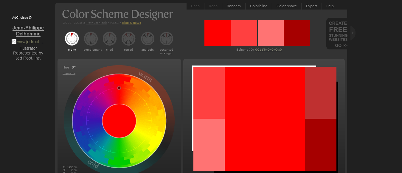
This is a color scheme designer which offers unlimited options. You can undo, redo, select from random color schemes and adjust them as well. It offers a wide range of color list and while selecting, you have the option to preview the color scheme as well.
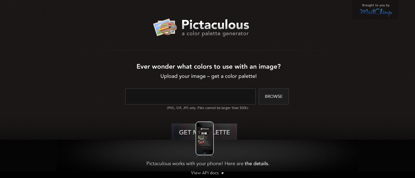
I personally love this app as it is so easy to use. It is basically a color palette generator so it reduces your work. It also works with your phone. All you need to do is upload an image and get a color palette for it. It is actually as simple as that.
Again, one of my personal favorites because it makes things simple for a color picker. All you need to do is select a color of your choice, and a 6-color matching palette will be automatically calculated. You have an ability to edit the palette. I recommend to read the FAQs in order to understand the usage in a better way.
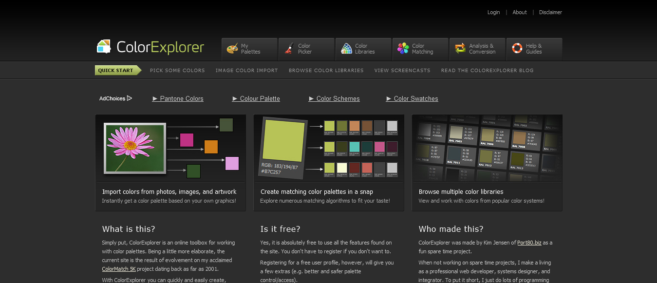
This is an online toolbox for working with your color palettes. You can easily and quickly create color palettes with this software. The best thing is, it is absolutely free.
Conclusion:
The above mentioned are some great tools that can help you with developing color schemes for your website. Make sure to keep in mind your brand's concept and latest trends while creating a color scheme. Creating a color scheme that is perfect for your site and brand could be a difficult task with many factors to consider, however, sing? tools, following trends and of course, using your aesthetic sense can surely help you develop the color scheme that is right for you.


Easter, a widely celebrated holiday, holds great importance in both religious and cultural aspects.
Read MoreThe Dodge Challenger Scat Pack is not just a car; it's a bold statement of performance and style.
Read MoreEvery year on the 17th of March, millions of people across the globe celebrate St.
Read MoreAI has been making significant strides in various fields, including website design.
Read MorePromoting your brand with visuals on social media is more than just sharing the right text or photos.
Read MoreIf we could do without colors, then God probably would have created humans color-blind.
Read MoreA variety of things cumulate to make an ecommerce site attractive enough to draw in customers and make them shop.
Read MoreWith Halloween right around the corner, it’s time to think about the scary colors associated with this very popular seasonal event.
Read MoreArticle provided by UNIPRINT QLD. You may have heard the terms CMYK full colour or PMS spot colour.
Read More